Color palettes for drawing room spaces play a powerful role in defining your home’s personality and comfort. The drawing room is often the first area guests see, making color selection especially important. In 2026, homeowners across the USA are choosing balanced palettes that combine warmth, elegance, and modern appeal. This guide explores practical color palettes for drawing room interiors that suit both small apartments and spacious homes.
Why Choosing the Right Color Palette Matters
The right colors influence mood, lighting, and how large or cozy a room feels. Light shades can make compact drawing rooms appear bigger, while deeper tones add richness and character. A well-planned palette also helps furniture and decor blend naturally.
Choosing thoughtfully prevents visual clutter and creates harmony. This is why selecting proper color palettes for drawing room design is a key step in interior planning.
Neutral Color Palettes for a Timeless Look
Neutral palettes using beige, cream, gray, and soft white remain a favorite for drawing rooms. These shades create a calm foundation and allow flexibility with furniture and accessories. Neutrals also reflect natural light, making rooms feel open and airy.
You can layer textures through cushions and rugs to avoid a flat look. Neutral tones are classic color palettes for drawing room spaces that never go out of style.
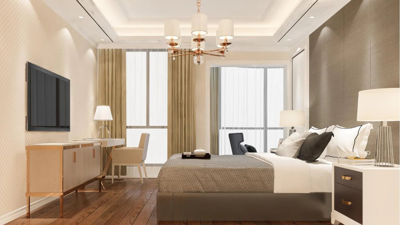
Warm Color Palettes for Cozy Atmosphere
Warm colors like soft browns, muted terracotta, and gentle gold tones add comfort and depth. These shades work well in homes that prioritize relaxation and welcoming vibes. Warm palettes pair beautifully with wooden furniture and soft lighting.
Accent walls or decorative cushions help introduce warmth without overpowering the room. Cozy themes are popular color palettes for drawing room interiors in modern homes.
Cool Color Palettes for a Modern Feel
Cool shades such as light blue, sage green, and soft gray offer a clean, contemporary look. These colors promote calmness and are ideal for minimalist or modern decor styles. Cool palettes also work well in well-lit drawing rooms.
Pair them with metallic or glass accents for a polished finish. Cool tones remain trending color palettes for drawing room layouts in 2026.
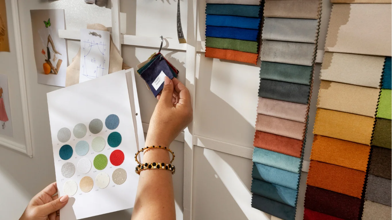
Two-Tone and Accent Color Combinations
Two-tone palettes combine a primary neutral with a bold accent shade like navy, emerald, or charcoal. This approach adds personality while keeping the room balanced. Accent colors can appear on one wall, artwork, or furniture pieces.
The key is moderation so the space doesn’t feel overwhelming. Two-tone styles are creative color palettes for drawing room designs seeking visual interest.
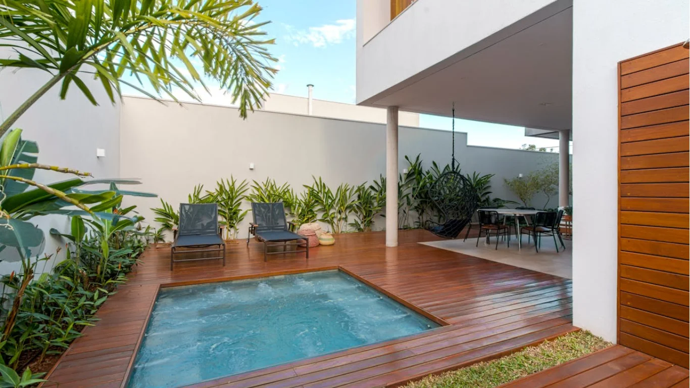
Earthy and Nature-Inspired Palettes
Earthy colors such as olive green, sand, and clay tones bring natural calm indoors. These palettes work beautifully with indoor plants and organic textures. They create a grounding effect that feels both modern and timeless.
Nature-inspired schemes are ideal for homeowners who prefer relaxed elegance. These are increasingly popular color palettes for drawing room transformations.
Matching Colors With Lighting and Furniture
Lighting affects how colors appear throughout the day. Always test paint samples under natural and artificial light before finalizing your palette. Furniture tones should complement wall colors to maintain balance.
Dark furniture pairs well with lighter walls, while light furniture benefits from slightly deeper shades. Coordination completes successful color palettes for drawing room styling.
Budget-Friendly Ways to Refresh Your Color Palette
You don’t need full repainting to update your drawing room. Changing cushion covers, curtains, or wall art introduces new colors instantly. Accent walls or peel-and-stick wallpapers also offer affordable upgrades.
Small changes can dramatically improve visual appeal. Budget updates support flexible color palettes for drawing room makeovers.
Conclusion
Color palettes for drawing room interiors define the mood, style, and comfort of your home. From neutral and warm tones to cool modern shades and earthy combinations, the right palette creates a welcoming atmosphere. By considering lighting, furniture, and personal taste, you can design a drawing room that feels balanced and beautiful. With these ideas, your space can reflect modern elegance in 2026 and beyond.
FAQs
What are the best color palettes for small drawing rooms?
Light neutrals and soft pastels work best for small spaces because they reflect light and make rooms appear larger and more open.
How do I choose an accent color for my drawing room?
Pick one bold shade that complements your main wall color. Use it sparingly on cushions, artwork, or a single feature wall.
Can dark colors work in a drawing room?
Yes, dark shades can look elegant when balanced with proper lighting and lighter furniture. They add depth and character to spacious rooms.
How often should I update my drawing room color palette?
Most homeowners refresh color schemes every two to three years. Smaller updates like accessories can be changed seasonally for variety.
What is the easiest way to test colors before painting?
Use sample paints on small wall areas and observe them under different lighting conditions. This helps avoid costly mistakes and ensures satisfaction.